-
1880 - 1882
-
Les Altures House
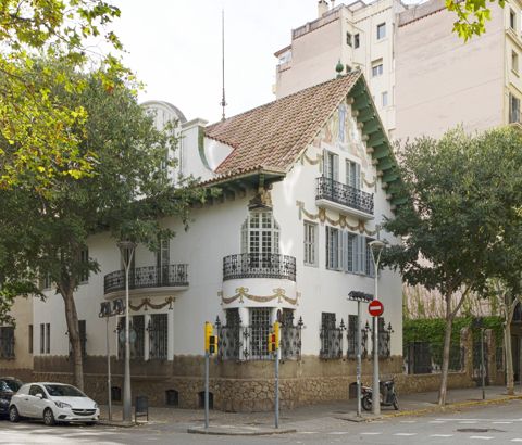
 The Casa de les Altures was commissioned by the director of the Societat d'Aigües, the Belgian engineer Nicolàs Recúlez Chevalier. The house is named like this because the motors used to lift water in the supply network generated from Dosrius were located next to it. It is a parallelepiped-shaped building with a rectangular base and a central opening that corresponds to a courtyard, with a body attached to the south façade in the form of a porch. The free space that is configured around the courtyard - based on arches supported by slender pillars - allows us to walk along the corridor to which the rooms of the house originally led - the ground floor was the day area, dining rooms, living rooms, library... -. The attic had a lower ceiling and housed the boilers, laundry rooms and various storerooms. The orientalism used in the resolution of the building's formal language was reflected in the profuse decoration on the floors, ceilings, wainscoting and wrought-iron railings.
1890
-
Segre Hydroelectric Power Building
autoria desconeguda
Industrial building - former textile factory - forming part of the urban fabric. Group of buildings constructed at different times. The entrance between partitions facing Carrer Llussà stands out, with a square floor plan and axis of symmetry. The stairwell is on one side. Exposed brick façades with dry joints. Round arched openings, with bricks laid in a book fold pattern. Lintels and drip mouldings also made of brick. Finished with a cornice and railings. Brick chimney.1894
-
1893 - 1896
-
Lebon Gas Company
Francesc de Paula del Villar Carmona
 The building - current headquarters of the "Mutua General de Seguros" - was built between 1894-1896 as a representative and office building for the Company of Gas Lebon following a project by the architect Francesc de Paula Villar i Carmona. The plot is part of a unique double block delimited by Carrer d'Aribau, Diputació, Balmes and Gran Via de les Corts Catalanes, mostly occupied by the large building of the University of Barcelona. It is a quadrangular building that sits on a rectangular plot, much of which was originally intended for a garden and is currently used as a car park. One of the most relevant aspects of this building and what makes it one of the most outstanding constructions of the end of the 19th century in Barcelona is precisely the originality of the project. We are referring to the fact that it looks like an exempt building despite being the head of a continuous band of buildings aligned on Carrer de Balmes. The architect achieved this effect by attaching the building to the middle of Carrer de Balmes, but opening its main façade towards the garden which was accessed from the Gran Via. The building consists of five levels of height clearly differentiated into three bodies. The lower one, almost like a base, has a very different material treatment from the rest of the façade. Made with stone blocks arranged in regular rows, it has two levels, a lower one where the current entrance to the Mutua is located (on Carrer de Balmes). Above this lower level there is a second floor, which opens to a series of low arches that give it the appearance of a gallery or very diaphanous body. However, this second level gains prominence in the area of the old garden where the main entrance was located. On this front, a monumental staircase with a stone railing gives access to the interior of the building through the second level. This entrance is also protected from atmospheric agents such as sun or rain through the overhang of the balcony that develops on the main floor. Regarding the rest of the façade, the homogeneity of elements and composition on the three fronts should be highlighted. In this sense, on top of the stone base, where the openings of the two interior levels are framed, the body of the façade is properly developed. Separated from the lower one by a running cornice, this becomes more prominent in the corners, where the towers develop, becoming an overhang that forms the base of the tribunes on the main floor. These tribunes are configured as a rectangular element resting on sculpted corbels, with a stone railing and Ionic columns that support an entablature that is the base of the balcony developed on the second floor. The windows on the main floor are framed by Ionic pilasters that incorporate several diamond-pointed ashlars into the shaft and that become the only ornamental element apart from the smooth entablature that crowns them. On the second floor, on the other hand, the windows – although they keep the same type of pilaster – are configured as a spandrel balcony and are finished with semicircular pediments that contrast with the mouldings on the top floor. The building is finished with a powerful cornice to which circular openings open in the form of portholes sculpted with floral decoration and which coincide with the vertical axis on which the windows are arranged. Above the cornice there is a last floor with mansards and a roof on a slope which is the result of a later work. As for the corner towers, as already mentioned, they present one more level than the rest of the façade, in which a kind of open gallery develops through a triple opening with arch and central pillar. The towers are covered with a false mansard roof that is topped with a flat roof with an iron railing. Unlike the base level made of stone, in the rest of the façade the predominant material is brick, arranged in horizontal strips and which contrasts with the whiteness of the artificial stone of the mullions and lintels of the windows. The building was designed by the architect Francesc de Paula Villar i Carmona in 1894 on behalf of the company Gas Lebón – one of the pioneers in the state in the production and marketing of gas for public and private lighting of the city. The original project did not foresee the mansards, which are an added element that considerably modified the perception of the façade, as it visually narrows the angular turrets and reduces the verticality of the whole in general.
1894 - 1896
-
1896 - 1897
-
Mercantile Credit Society
 Located in the Ciutat Vella district, the building of the Mercantile Credit Society stands on the southern corner of the block bounded by Carrer Ample, Carrer dels Còdols, Carrer de la Rosa and Carrer de Serra. It has two facing façades onto the first two streets and shares a partition with the neighbouring plot. The principal entrance is from Carrer Ample. Rectangular in plan, the building’s vertical structure comprises a semi-basement, ground floor, two upper floors, an attic and a roof terrace, although the attic is not visible from the façade facing Plaça de la Mercè. The main entrance leads into a vestibule area and to a central rectangular courtyard from which rises the principal staircase providing access to the main (first) floor. The two façades organise their openings along vertical axes in a regular rhythm: shutters and large windows on the ground floor, enclosed balconies on the principal floor, and windows on the second floor and in the attic. Both façades, profusely ornamented, are entirely finished in Montjuïc stone. The semi-basement forms part of a stone plinth with a smooth finish, the same treatment used on the walls of the first and second floors and the attic. By contrast, the ground floor, as well as the pilasters framing the two façades of the building, display a finish of rusticated ashlar masonry laid in broken courses. The ground-floor windows are crowned with flat arches, except for the large entrance portal, which is topped by a segmental arch whose keystone is carved with a lion’s head holding a door knocker. In the spandrels of this arch are sculpted two large corbels composed of foliage volutes and female busts that support the large stone slab of the projecting central balcony. This balcony, enclosed by a cast-iron balustrade, features a doorway with moulded jambs and is crowned by a semicircular pediment above a frieze carved with vegetal motifs and two volute-shaped corbels. The remaining balconies on this floor share similar characteristics, although they do not project; instead, they have flush balustrades decorated with carved peltas (Greek shields) and laurel wreaths. Moreover, the pediments above their lintels are triangular. These highly elaborate decorative elements disappear in the windows of the second floor and the side façade, which are framed by a simple moulding with convex angles. The central balcony of the principal façade is flanked by two Corinthian pilasters that bear the weight of a large semicircular arch. Within this arch opens a French window flanked by two reliefs representing allegories of Industry (on the left) and Commerce (on the right). Crowning the central bay, a moulded triangular pediment rests upon the substantial cornice that finishes the façades of the building. The main doorway gives access to a rectangular vestibule with chamfered corners, which houses the staircase leading to the central courtyard, a rectangular space adorned with columns.
1896 - 1900
-
1900
-
New Customs Building
Pere García Faria i Monteys, Enric Sagnier i Villavecchia
 Located in Barcelona's port area, the Nova Aduana is located in the expansion area of the new loading and unloading docks and replaces the old customs house, which was housed in an 18th-century building near the Port Vell. The new construction sought to monumentalise the maritime entrance to the city and, at the same time, to rationalise the control and valuation of goods. In this project, Sagnier counted with the collaboration of the architect Pere Garcia Fària, a specialist in the drainage of the city and an engineer in roads, canals and ports. The commission was formulated in 1890, but the project was not approved until 1895, after suffering many obstacles and alterations, as it was a public building controlled by the State and its layout had to be approved by the Royal Academy of Fine Arts of San Fernando. The building adopts an H-shaped layout, as the initial idea of the customs technicians was that goods would enter at one end, pass through the inspection room and exit at the other end, but in practice its use could not be so rational, due to the bureaucratic formalities. On the outside, the building has a monumental appearance, with certain echoes of Central European architecture, especially on the façade facing the city, while on the quayside the architectural lines are more sober. As in other projects, Sagnier avoids the monotony of the main façade by combining horizontal lines in the attic and vertical lines in the windows on the main floor, with the counterpoints of the two lateral bodies and, especially, the central core containing the entrance. This central body, where the inscription ‘Aduana’ appears in severe capital letters, concentrates most of the sculptural work and is crowned by a coat of arms of Spain and two large eagles, the work of the sculptor Eusebi Arnau, while at each end there are four griffins or winged lions. The chronicles of the time criticised the excessive proportions of these decorative elements ‘belonging to the fauna’ and the fact that the building did not clearly express its purpose.
1895 - 1902
-
Antiga Seu del Banco de España a Girona
Josep Martí i Burch, Martí Sureda i Vila
 La seu (fins al 1990) d’aquest banc es va alçar a la perifèria d’una ciutat encara murallada, però amb un dinamisme terciari que ha perviscut fins ara. En procés d’obra el 2008, la transformació desestima els espais interiors i salva una façana d’un eclecticisme vibrant, en la qual el neogòtic delinea unes esveltes pautes verticals encastellades en què va encaixant els seus propis estilemes, alternats amb els d’un neoclàssic reduït al paper de simple comparsa lingüístic.
1901 - 1902
-
Refurbishment for the headquarters of the Centre Excursionista de Catalunya
 Barcelona's Roman temple dedicated to Augustus was located at the top of Mount Taber, and part of its remains were embedded in medieval constructions. In 1903 Domènech renovated the building as the headquarters of the Centre Excursionista de Catalunya. Despite several studies of the temple, many elements were lost in the rubble of the old houses at the end of the 19th century. In 1879, an entire column was saved and displayed in the Plaça del Rei. Three other columns were found inside the medieval building that housed the old cathedral canons' manor house, embedded between several slabs. This building was rented in 1878 by the Associació Catalana d'Excursions Científiques (Catalan Association of Scientific Excursions), now known as the Centre Excursionista de Catalunya. In 1902, the publisher Ramon de Montaner, Lluís Domènech's uncle, bought the entire building. His initial intention was to take the columns and integrate them into the Castle of Santa Florentina. But they finally changed his mind, and he commissioned his nephew to refurbish the building as the headquarters of the Centre Excursionista de Catalunya. The intervention consisted mainly of remodelling the interior of the building to leave the Roman columns exposed, fully visible in an interior courtyard protected by a skylight. A new staircase was built to access the main floor and a gallery to connect the two sides of the courtyard, reinterpreting the Gothic style. The opening of large windows and the replacement of the stone railings with light metallic elements was done with the aim of giving greater visibility to the columns from inside the rooms. Domènech left the space prepared for the fourth column found, which was on display in the Plaça del Rei, but bureaucracy did not allow it to be repositioned. Finally, in 1956, when Barcelona City Council had already bought the building, it was moved. It is still the headquarters of the CEC today.
1903 - 1905
-
1905
-
La Caixa de Barcelona Branch Office
 In 1906, August Font i Carreras was commissioned to design the Gracia branch of the Caixa d’Estalvis i Mont de Pietat de Barcelona. August Font himself had already designed the Caixa de Barcelona building in Plaça Sant Jaume and a branch office in Carrer de Sant Pau. The building is located on the block bounded by Carrer Jesús, Carrer Sant Pere Màrtir, Carrer de Gràcia and Gran de Gràcia, where the façade opens onto the street. The building is inscribed in a regular polygonal plot and is developed on three levels of elevation: ground floor and two floors, topped by a rooftop. Today, only the façade remains of the original architectural project, which consists of a three-storey rectangular façade and a five-storey tower attached to the far left-hand side of the building. Built entirely of stone, it is notable for the presence of elements from the Catalan medieval building tradition, such as the mullioned windows on the first floor and the rooftop on the top floor. Even so, these elements are not faithful to the traditional forms, but were reinterpreted by the architect, giving the complex a Gothic appearance. The tower, which has a hip roof, has a door on the ground floor leading to the staircase. It is a door with a mixtilinear lintel and sculpted mullions, with two female figures accompanied by vegetal elements on the imposts. Crowned by the coat of arms of Barcelona, the ground floor is separated from the next floor by a moulded impost, where there is a niche in the form of a window with an image of the Virgin Mary. The first floor opens onto the street through a window with a mixtilinear lintel and, finally, the clock face above it. The tower is closed with a large cornice on corbels on which the top floor of the building is built – a series of windows between columns form a continuous gallery that surrounds the tower on all four sides. On the ground floor there is the entrance to the current offices of La Caixa, with a central doorway flanked by two pairs of windows with large arches on columns resting on a high plinth. This ground floor is separated from the first floor by a sculpted cornice on which we can read: ‘Caja de Ahorros y Montepío de Barcelona. Sucursal de Gracia' (Barcelona Savings Bank and Montepío de Barcelona. Gracia Branch Office). On the first floor there are three crown windows inspired by the Middle Ages, but reinterpreted both in the shape of the lintel and the plant decoration. Finally, on the second and last floor, there is a gallery that recovers the medieval and Renaissance style with mixtilinear arches on columns. Above this level we can find the eaves and the roof railing. The latter, with moulded elements in the form of battlements, is decorated with ceramic and iron elements.
1906
-
Villa Flora
 Two-storey house from 1920 with a detached ground floor and a separate gate at the entrance. It has a very large garden which continues on the other side of the stream, with a large entrance gate. Inside the garden there are small temples, fountains and other architectural elements. The building has influences from different styles, as the author was a man who traveled a lot. The influence of the Vienna Secession stands out.
1910
-
1911
-
Pelegrí Güell House
House between partitions and three corridors. It consists of a ground floor, two floors and an attic. The roof is gabled and made of Arabic tiles. It is worth noting the entrance door with a carpenter arch, as well as the hall. It has undergone successive refurbishments and extensions during the 19th century, which have changed its initial appearance. The most remarkable example of which is the angled tribune with an upper roof located on one of the sides. The main interest of this work is its typological value. In 1913, the architect Santiago Güell carried out several renovations to the main floor and the expansion works of the side tribune.1913
-
1915
-
Cañas i Mañé House
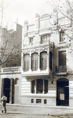 Building between ground floor partitions and two floors with two façades, the main one on 20 Rambla de Nostra Senyora and the rear one on 33 La Palma Street. On Rambla de Nostra Senyora the façade has an asymmetrical composition, with a ground floor entirely transformed by the current commercial use, a main floor with a large tribune with three openings and a balcony located to its right, and an upper floor with a central low-arched window, two side windows and a balcony spanning the window centre and the right window. The top of the façade is formed by a stepped crowning with floral ornamentation with retouches and sgraffito. On La Palma Street, the façade presents a symmetrical composition of the upper floors, while the ground floor has the access portal shifted to the right. On the main floor there is a balcony with a wrought iron railing that takes up the entire width of the façade, with two arched openings crowned by circular pediments. On the upper floor there are two recessed openings with a sill that protrudes from the façade. The facing of the façade is smooth and is crowned with a cornice supported by corbels. The house was designed by the architect Antoni Pons i Domínguez.
1911 - 1916
-
Caixa de Pensions per a la Vellesa i d'Estalvis
 The opening of the Via Laietana, a street running through the old quarter of Barcelona, led to the demolition of old buildings and their replacement by new buildings such as this one for the headquarters of the Caixa de Pensions. Many of the buildings along the new road housed financial institutions and, little by little, the area specialised in the type of office building that was then a novelty. In 1911, Sagnier himself had already built the offices of the Banco Hispano Colonial at the other end of the street, one of the financiers of the urban development operation known as the ‘Reform’. The Casal de l’Estalvi (with the adjoining building called Casal de la Previsió, built five years later) closes the perspective of the new street and benefits from its picturesque Gothic appearance and the solidity of the Garraf stone. Over the years, the branches of la Caixa in various towns in Catalonia, also designed by Sagnier, took up some of the elements of this first building, such as the rough-hewn stone walls, thus unifying the corporate image of the institution in a very modern way. Another outstanding aspect of the building was its construction with a concrete structure, a material hitherto practically reserved for industrial buildings. However, the material was not evident either on the outside or in the interior, which was lavishly decorated. Of the five buildings and two shops by Sagnier that won prizes in the Barcelona City Council architectural competitions, only the Casal de l’Estalvi (together with Ignasi Coll's house on Avinguda del Tibidabo) has survived to the present day. The plaque that was affixed to the façade in such cases is still visible; the prize was also an extraordinary prize. It was the third time that Sagnier had received the award and this earned him the gold medal instituted by the City Council. Over the years, Sagnier maintained a close relationship with the savings bank founded by Francesc Moragas and Lluís Ferrer-Vidal, for which he still carried out other buildings, especially for the welfare services of its social work.
1917
-
Caves Hill
 The housing and office building of Caves Hill is located at one end of the urban centre of Moja, at the confluence of Bonavista and Llarg streets. It is a house with a ground floor and a main floor, which occupies an entire block. The main façade has a symmetrical composition, with three openings for each floor. The most interesting elements of the construction are the framing of the openings, the stepped crowning and the eaves as well as the use of exposed brick. The architectural language is Modernism. The building was most likely built in 1918.
1918
-
1919
-
1920
-
Casal de la Previsió
 At the entrance to Carrer Jonqueres, Carrer Ortigosa and Carrer Ramon Mas, we find the annex building of La Caixa de Pensions per a la Vellesa i d'Estalvis (Old Age Pensions and Savings Bank). Both buildings, designed by Enric Sagnier, located opposite each other, share many formal characteristics. The Casal de la Previsió, as it was originally called, is a partially isolated corner building, which touches the back of the Palau de la Música. It uses white Garraf stone for the main façade, combined with tiles on the secondary façades, as does the Casal de l’Estalvi. It also coincides with the latter in the neo-Gothic language of the finishes, although it responds to a much more modern typology close to the new conceptions of office buildings. The main façade combines rounded walls at the corners and the central body with flat, high bodies with battlements, with a medieval aesthetic. This façade has sculptural ornamentation attributed to Eusebi Arnau. At the back of the building, corresponding to the streets Ortigosa and Amadeu Vives, there is a doorway decorated with reliefs that gives access to the part of the building occupied by large dwellings.
1920 - 1922
-
1922
About
In this first stage, the catalogue focuses on the modern and contemporary architecture designed and built between 1832 –year of construction of the first industrial chimney in Barcelona that we establish as the beginning of modernity– until today.
The project is born to make the architecture more accessible both to professionals and to the citizens through a website that is going to be updated and extended. Contemporary works of greater general interest will be incorporated, always with a necessary historical perspective, while gradually adding works from our past, with the ambitious objective of understanding a greater documented period.
The collection feeds from multiple sources, mainly from the generosity of architectural and photographic studios, as well as the large amount of excellent historical and reference editorial projects, such as architectural guides, magazines, monographs and other publications. It also takes into consideration all the reference sources from the various branches and associated entities with the COAC and other collaborating entities related to the architectural and design fields, in its maximum spectrum.
Special mention should be made of the incorporation of vast documentation from the COAC Historical Archive which, thanks to its documental richness, provides a large amount of valuable –and in some cases unpublished– graphic documentation.
The rigour and criteria for selection of the works has been stablished by a Documental Commission, formed by the COAC’s Culture Spokesperson, the director of the COAC Historical Archive, the directors of the COAC Digital Archive, and professionals and other external experts from all the territorial sections that look after to offer a transversal view of the current and past architectural landscape around the territory.
The determination of this project is to become the largest digital collection about Catalan architecture; a key tool of exemplar information and documentation about architecture, which turns into a local and international referent, for the way to explain and show the architectural heritage of a territory.
About us
Directors:
2019-2026 Aureli Mora i Omar OrnaqueDocumental Commission:
2019-2026 Ramon Faura Carolina B. Garcia Eduard Callís Francesc Rafat Pau Albert Antoni López Daufí Joan Falgueras Mercè Bosch Jaume Farreny Anton Pàmies Juan Manuel Zaguirre Josep Ferrando Gemma Ferré Inés de Rivera Fernando Marzá Moisés Puente Aureli Mora Omar OrnaqueCollaborators:
2019-2026 Lluis Andreu Sergi Ballester Marianela Pla Maria Jesús Quintero Lucía M. Villodres Montse ViuExternal Collaborators:
2019-2026 Helena Cepeda Inès MartinelWith the support of:
Generalitat de Catalunya. Departament de CulturaCollaborating Entities:
ArquinFADFundació Mies van der Rohe
Fundación DOCOMOMO Ibérico
Basílica de la Sagrada Família
Museu del Disseny de Barcelona
Fomento
AMB
EINA Centre Universitari de Disseny i Art de Barcelona
IEFC
Fundació Domènench Montaner.
ETSAB
Suggestion box
Request the image
We kindly invite you to help us improve the dissemination of Catalan architecture through this space. Here you can propose works and provide or amend information on authors, photographers and their work, along with adding comments. The Documentary Commission will analyze all data. Please do only fill in the fields you deem necessary to add or amend the information.
The Arxiu Històric del Col·legi d'Arquitectes de Catalunya is one of the most important documentation centers in Europe, which houses the professional collections of more than 180 architects whose work is fundamental to understanding the history of Catalan architecture. By filling this form, you can request digital copies of the documents for which the Arxiu Històric del Col·legi d'Arquitectes de Catalunya manages the exploitation of the author's rights, as well as those in the public domain. Once the application has been made, the Arxiu Històric del Col·legi d'Arquitectes de Catalunya will send you an approximate budget, which varies in terms of each use and purpose.


